Last week, a classmate let me in on her geeky little math game: look for license plates that need operators inserted to make a math sentence (224 turns into 2+2=4, for example). It’s an interesting little game, but I like my math a little more…um, pictoral.
That probably explains why my “math in the world” fascination runs towards graphs. Below, I’ve presented some my favorite Internet people who make graphs. They’re fun. They’re eerily insightful. And sometimes they make me laugh.
5. Wordle
Because a huge number of the bloggers I read pointed to Wordle in the last few weeks, I finally dragged myself over there to see what the hub-hub was about. Here’s my Wordle representation of all the tags I use on del.icio.us:

4. information aesthetics
What a great blog! information aesthetics gathers beautiful graphs from all over. Their content leaves me somewhere between “I never thought to track that” and “These graphs *look* so nice”. Here’s a recent photo of caffeine consumption (the arc is the length of time the caffeine stays with you).

3. Annual Reports
Based on the Feltron Report, this contest by math teacher Dan Meyer featured amazing infodesign from teachers and students.
2. xkcd.com
xkcd makes me LOL about once a week. But there was one in particular that captured my infodesign mind.

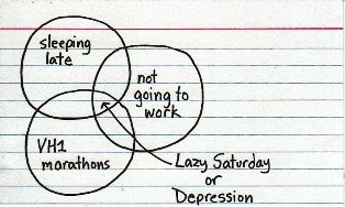
1. indexed
Jessica Hagy over at indexed has a lot of love for Venn Diagrams.
It occurs to me that reading graphs is increasingly useful (tongue planted firmly in cheek: a 21st century skill, perhaps?). Reading graphs like those above require a good dose of left and right brain input. Which might explain why in the last 5 years, increasing numbers of non-mathy people are drawing up graphs to explain some relationship or another (they’re popping up all over).

This is the link to Edward Tufte’s site that is required by federal law whenever mentioning data visualization. All his books are excellent, but The Visual Display of Quantitative Information should be required reading for everyone. Besides which, I have never had a better aesthetic experience reading than I have reading his books.
I had the great good fortune to attend one of his seminars last year. Putting together presentations his way is laborious but amazingly effective at facilitating communication. I will put together bullet-point slide decks again in my future, but never without a sense of shame at short-changing my audience.
phil
Hahaha! Federal law.
I will definitely have to check Tufte out. Seems to me I recall you talking of him when we were back at SecureWorks.
Meanwhile, students in my Masters program seem to think 40 words per PowerPoint slide is perfectly acceptable. I’ll save that topic for another post, though.